

Doc's Daily Commentary

Mind Of Mav
The Dawn Of A New Monetary Era – The Role Of Inflation
Welcome to the back half of the year.
Yep, that’s right, we’re only halfway done with this carnival of terror called 2020.
So, let’s talk about how we got to where we are, what it means, and where we’re going.
Central to any such discussion is money; as we’ve recently covered in length, the dollar is at the heart of the power struggle currently going on. If that’s the case, what is the driving force behind the dollar’s economic power? Inflation. Who cares the most about inflation? The Fed, of course.
Since the beginning of 2020, the Federal Reserve has poured over $2.9 trillion worth of freshly minted dollars (mostly using the 0’s and 1’s of a computer) into the U.S. economy. Inevitably, as soon as the Fed fires up the printing press, fear of inflation, loosely defined as a general rise in the prices of goods and services, creeps into the hearts of many.
Others immediately point to the Great Recession and the then-unprecedented amounts of monetary stimulus in 2008–2014 and dire predictions of a second Zimbabwe that never materialized. Inflation sometimes seems like it belongs to a bygone era, but given the devastating effect it can have on unprepared investors, it is worth considering the matter more closely.
Quite simply: Understanding the historic and future role of inflation is central to understanding the current economic conditions, and what’s likely over the horizon for both legacy and new digital finance.
To better understand whether fears of inflation are justified, we must first understand what causes inflation and what role the money supply plays in the process — to that end we’ll cover the following:
In Part I we’ll discuss what causes sellers of goods and services to raise their prices.
Part II discusses the relationship between the money supply and inflation, and why the dramatic steps the Fed took after 2008 didn’t ultimately lead to inflation.
Part III discusses the new role the Fed is playing in purchasing government debt, a brief refresher on Modern Monetary Theory (MMT), and how these trends could affect long term inflation.
Part I — What Causes Inflation
For inflation to happen, sellers of goods and services have to decide to raise prices. Since raising prices always causes buyer pushback, there are generally two reasons sellers would choose to do so: either their own costs are increasing — cost-push inflation — or sellers see very strong demand for their product — supply-pull inflation.
Cost-push inflation or rising production costs is the classic inflation story. As the economy heats up and unemployment decreases, sellers have to pay higher salaries, and thus must charge higher prices for their goods. Expecting prices to go up, job seekers demand ever higher salaries, which raises production costs, and thus expectations of inflation cause actual inflation.
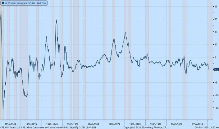
Chart 1 — Inflation going back to 1920s, in percentage, with recessions highlighted. Before 1985, a recession was always followed by a spike in inflation; however, after 1985, the Fed succeeded in maintaining the price stability to keep inflation within a pre-determined, acceptable range. Source: Bloomberg Finance
Production costs can also increase because of shortages in capital or raw materials. This was the case in the 1970s when the oil crises drove up production costs, leading to a period of rising prices despite reducing production, also known as stagflation.
The other side of the inflation story is an increase in aggregate demand for goods and services by households, businesses, governments, and net exports. This could occur in an overheated economy, or because of a sudden increase in government spending. In a globally interconnected economy, fluctuations in exchange rates and diverging growth paths can also increase demand for net exports. Facing increasing demand, sellers decide it is worth raising prices.
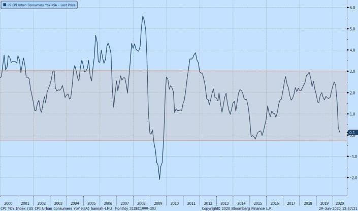
Chart 2 — CPI YoY change, in percentage, 2000–2020. The shaded bar represents the range of inflation between -0.3% and 3%, indicating the acceptable levels of inflation. The Fed managed to maintain the inflation within the acceptable range after the 2008 recession, except a short period at the end of 2011. Source: Bloomberg Finance
In summary, inflation has to be caused by a mismatch between supply and demand that causes sellers to increase their prices. Increasing prices is unpopular and sellers will only do so if their prices increase, or if there is so much demand as to make price hikes worthwhile. But in between sellers and buyers is a medium of exchange, the currency, and it has the power to dominate mismatches of supply and demand.
Part II — “Inflation Is Always and Everywhere a Monetary Phenomenon” — Except When It Isn’t
The above quote from Milton Friedman embodies the essence of what economists refer to as the Quantity Theory of Money. The idea is that prices, and thus inflation, are determined by three forces: the amount of money in circulation, the velocity of money (the frequency of transactions in the economy), and the real value of the goods and services in the economy. The relationship between the supply of money and prices is a direct one — for a fixed amount of GDP, if the money supply increases then prices should go up. A decrease in GDP, which is when the Fed typically increases the money supply to spur growth, has a further inflationary effect, as more money is chasing fewer goods.
The Quantity Theory of Money suggests that if the Fed drastically increases the money supply while GDP is going down, we should see high levels of inflation. Following the 2008 Financial Crisis, the Fed poured $3.6 trillion, most famously through its government bond-buying program known as Quantitative Easing. And yet, to the surprise of nearly everyone, inflation never arrived. Except for a hot second in late 2011, inflation never exceeded 3%.
Economists are still split over why increasing the money supply by 24.3% of GDP did not cause inflation, but the emerging consensus is that the majority of that money never made into the hands of consumers.
The traditional mechanism that central banks use to control the money supply is the interest rate they give commercial banks on their deposits. In the U.S. this is known as Federal Funds Rate. In theory, when commercial banks can borrow at lower rates, they can lend more money to households and businesses at lower rates. The central bank can also influence commercial bank lending by tightening or easing restrictions on the capital reserves commercial banks must keep on their books.
In effect, central banks do not control the money supply directly, but by proxy through commercial bank lending. Each dollar lent to commercial banks is levered many times over as the bank makes loans. But if commercial banks stop lending, as was the case after 2008, it doesn’t matter how low-interest rates are, the money supply will not increase. Thus, the relation between the money supply and inflation is not directly in the hands of the Fed.
The second monetary tool that came into popular use by central banks following the Financial Crises is Quantitative Easing (QE). In an attempt to put even more cash into the system and lower long-term interest rates, central banks began to buy treasury bonds and mortgage-backed securities from commercial banks to the tune of $3.6 trillion. By creating demand for long-duration government bonds the Fed drove down long-term interest rates.
QE also put more money into the hands of commercial banks in return for the bonds they sold the Fed. In theory, this is money the banks could turn around and lend to the public. However, here again, the Fed is dependent on banks’ willingness to lend. As Chart 3 demonstrates, household debt (including mortgages, credit card loans, etc.) did not return to its 2008 peak until 2016. Lending to corporations fared a bit better, but also did not fully recover until 2014.
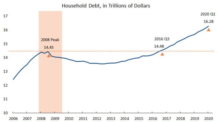
Chart 3 — Debt securities and loans of households and nonprofit organizations, in trillions of dollars, 2006–2020. The household debt did not return to its 2008 peak level until the third quarter of 2016, taking around eight years for a full recovery. Source: FRED Economic Data
The main reason that QE did not result in inflation is that most of that money never made it into the hands of those who would spend it. This means that there wasn’t enough demand to cause demand-pull inflation. Instead, the QE money was held by banks as reserves against the many toxic assets — mostly bad loans — they entered the crisis with. In practical terms, most of the QE money was used to bail out the financial industry from the crisis they created several years earlier.
QE trickled into the financial markets in other ways, namely by inflating asset prices of all types, though the mechanism here is less clear. In part, the Fed’s injection of money into the system creates a perception of growth, which in turn fuels actual growth as optimistic consumers and businesses spend money.
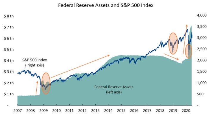
Chart 4 — Federal Reserve assets, in trillions of dollars, and S&P 500 Index. The orange arrows represent the upward/downward trend of Federal Reserve assets; The orange ovals highlight the turning points of S&P 500 Index. In the QE periods, during which the Federal Reserve continued expanding its balance sheet, the S&P 500 Index transitioned from a downward trend to an upward trend and kept increasing, and vice versa. The turning points of S&P 500 Index followed changes in Federal Reserve assets. Source: FRED Economic Data
But there is also a more sinister mechanism at play here, namely corporate borrowing and stock buybacks. While corporate lending didn’t recover until 2014, it ultimately blew though the previous 2008 high of $1.6 trillion and by the end of 2019 reached $2.4 trillion. Of course, some of this money was invested by businesses for growth in things like R&D, but much of this money was used to pay out dividends, and more concerning, for stock buybacks. The total amount spent by corporations on buybacks between 2008 and 2018 is estimated at $4.3 trillion.
Much has been said about the perils of buybacks — there are good reasons they were banned until legalized by the Reagan administration in 1982. But another outcome of buybacks is their contribution to wealth inequality. Namely, the wealthiest 10% of Americans hold 84% of all stocks. Unlike dividends, buybacks do not directly put capital in the hands of long-term holders of stocks such 401Ks and pension plans.
No conversation about inflation would be complete without mentioning the deflationary power of wealth concentration. Stock buybacks and debt-fueled stock markets are only one reason for the widening gap between the ultra-wealthy and the middle class. Other reasons include the devastation of home prices in the Great Recession, the key asset for middle-income families, and changes in the workforce. Technology and the gig economy almost certainly also played a role. Whatever the reasons, the outcome cannot be disputed — the top 10% of wealthy Americans now hold 70% of all wealth, compared with 62.6% in 2000.
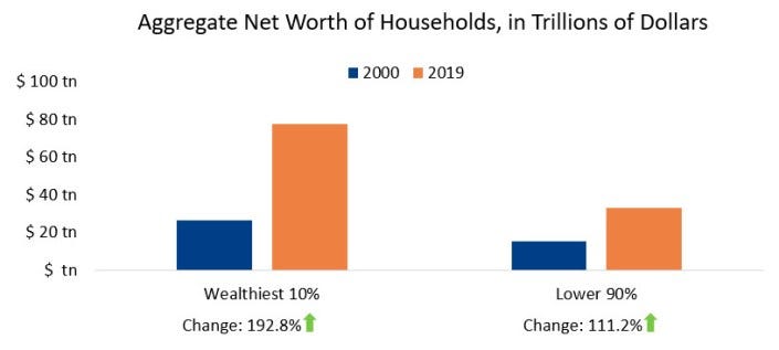
Chart 5 — Income inequality, showing aggregate net worths of the wealthiest 10% households and of the lower 90% households in 2000 and 2019, in trillions of dollars. The wealthiest 10% households underwent a 192.8% growth in aggregate net worth from 2000 to 2019, 81.6 points higher than the growth of the lower 90% households for the same period. Source: The Federal Reserve Data System, Distribution of Household wealth in the U.S. since 1989
The mechanism tying income inequality to inflation is straightforward: wealthier families do not spend as much of their wealth on a percentage basis. If a middle-income family gets $2,400 from the government, they are likely to spend more of that on goods and services than a wealthy family. The wealthy save a larger percentage of their assets, and these go back into the financial markets, further inflating asset prices but not the CPI.
In sum, the maxim that the supply of money is solely responsible for inflation does not survive contact with reality. It is not enough to increase the money supply; where the new money goes matters. Pumping trillions of dollars into the financial system may boost the economy without causing inflation, but as we all know, there’s no such thing as a free lunch.
We’ll finish up with part 3 tomorrow when we discuss The Dawn of a New Monetary Age

The ReadySetCrypto "Three Token Pillars" Community Portfolio (V3)
Add your vote to the V3 Portfolio (Phase 3) by clicking here.
View V3 Portfolio (Phase 2) by clicking here.
View V3 Portfolio (Phase 1) by clicking here.
Read the V3 Portfolio guide by clicking here.
What is the goal of this portfolio?
The “Three Token Pillars” portfolio is democratically proportioned between the Three Pillars of the Token Economy & Interchain:
CryptoCurreny – Security Tokens (STO) – Decentralized Finance (DeFi)
With this portfolio, we will identify and take advantage of the opportunities within the Three
Pillars of ReadySetCrypto. We aim to Capitalise on the collective knowledge and experience of the RSC
community & build model portfolios containing the premier companies and projects
in the industry and manage risk allocation suitable for as many people as
possible.
The Second Phase of the RSC Community Portfolio V3 was to give us a general idea of the weightings people desire in each of the three pillars and also member’s risk tolerance. The Third Phase of the RSC Community Portfolio V3 has us closing in on a finalized portfolio allocation before we consolidated onto the highest quality projects.
Our Current Allocation As Of Phase Three:

Move Your Mouse Over Charts Below For More Information

The ReadySetCrypto "Top Ten Crypto" Community Portfolio (V4)
Add your vote to the V4 Portfolio by clicking here.
Read about building Crypto Portfolio Diversity by clicking here.
What is the goal of this portfolio?
Current Top 10 Rankings:

Move Your Mouse Over Charts Below For More Information

Our Discord
Join Our Crypto Trader & Investor Chatrooms by clicking here!
Please DM us with your email address if you are a full OMNIA member and want to be given full Discord privileges.