

Doc's Daily Commentary

Mind Of Mav
Why Has Cash Become Trash?
Why has money lost value?
In the old days, our monetary system had intrinsic value. It was directly linked to gold.
Post World War II in 1944, the leading Western powers developed the Bretton Woods Agreement which formed a framework for global currency markets.
Every world currency was valued against the US dollar, and the dollar, in turn, was convertible to gold at the fixed rate of $35 per ounce.
In the so-called gold standard, US citizens could convert $35 at a bank for an ounce of gold. By 1976, this system had been completely abandoned — the tie between dollars and gold was cut entirely.
At that point, we firmly entered into the era of fiat money.
fiat (fi·at | \ ˈfē-ət) — an authoritative or arbitrary order : decree
fiat money — currency established as money by government regulation
Money was no longer backed by an inherently valuable asset (gold) — it was the trust of the government issuing it that stood behind the money and gave it value.
In an age where money is not tied to anything but the government backing it, said government is free to do whatever it pleases with it.
Such monetary policies are controlled by humans — meaning they are prone to greed and error. History has shown that this often leads to governments devaluing their currencies, most often through inflation.
Inflation is cruel and complex. When the government introduces more money into the system, it eventually trickles down into the economy. At that point, the people who held cash lost part of their purchasing power.
That’s to be expected, after all. If demand is the same, the price of goods and services is generally proportional to the monetary supply in an economy. That is, if you have $100 dollars and 100 apples in an isolated system, one apple would be worth $1. If you are to double the dollars to $200 and nothing else changes, one apple would logically follow to be worth $2.
From the perspective of a single person, this effect isn’t as obvious. If you had $1 at one point, you believed you had enough to buy one apple. But gradually, apple prices rise to $2 and you get left behind. This is because new money in the system does not spread evenly.
If you were to hold your dollar throughout the rise, you would have lost 50% of your purchasing power.
A peculiar thing can be observed in markets:
Denominated in gold, the S&P 500 had the same price in February 2007 as it did in November 2019, despite the respective nominal prices in dollars being $1,444 and $3,176.
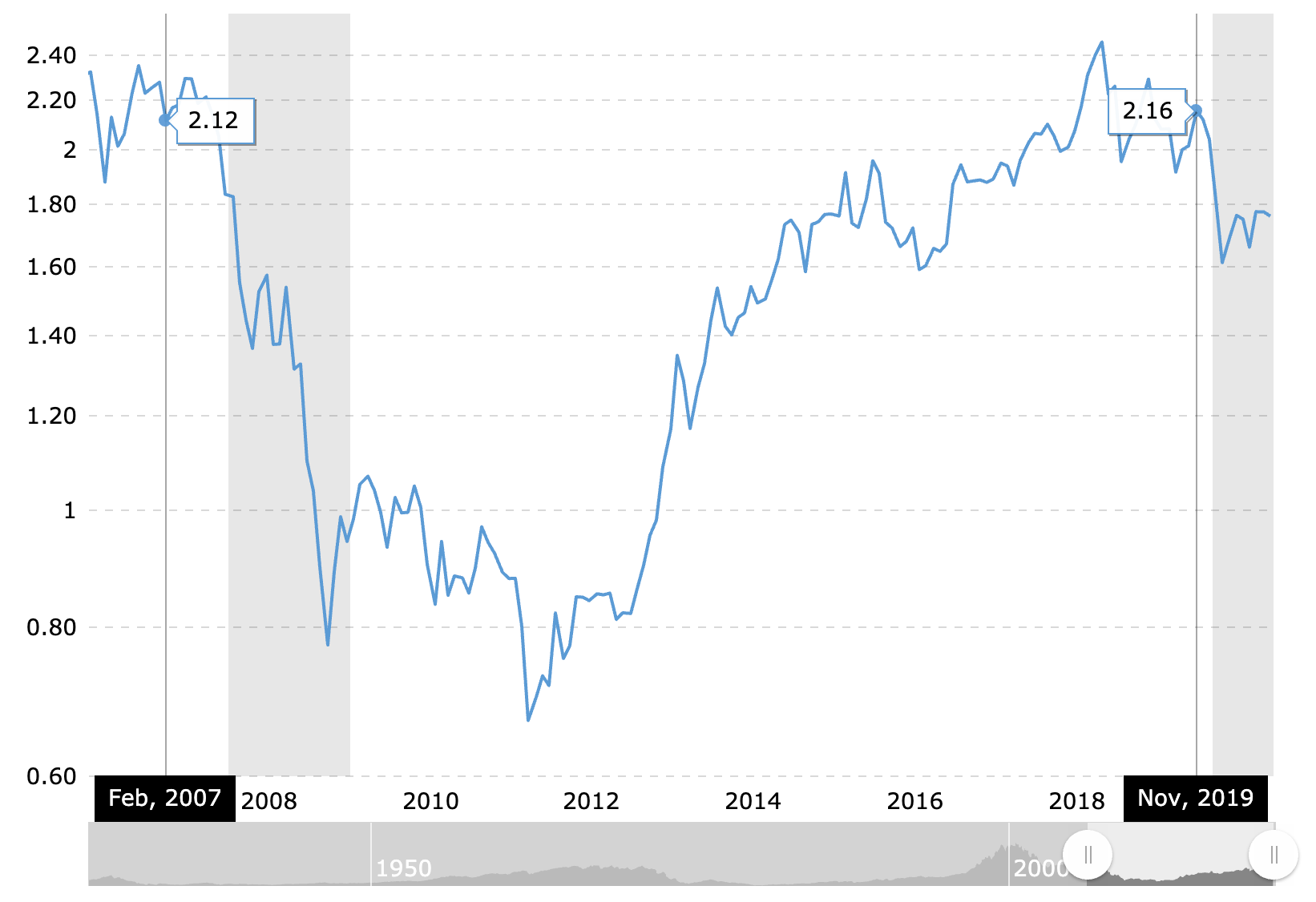
If you were to sell a share of the S&P 500 in 2007 for $1444 and held it until Nov 2019, you would not be able to buy the same share of the S&P anymore — only half. Conversely, if you were to sell a share of the S&P 500 for 2.12 oz of Gold at that time, in Nov 2019 you could have rebought that S&P share.
Again, if you were to hold your dollar throughout the rise, you would have lost 50% of your purchasing power.
While demand and market narrative certainly play a role, a driving cause is the increase of money in the system. For the S&P 500 to grow 100% and keep the same price in oz of Gold, it means the price of Gold must have risen at the same rate.
While it recently has been the subject of market manipulation, Gold’s price rises with inflation in the long-term.
To help drive the point — look at the monetary supply of US dollars. It has more than doubled from February 2007 to November 2019, just like Gold and the S&P 500’s price.
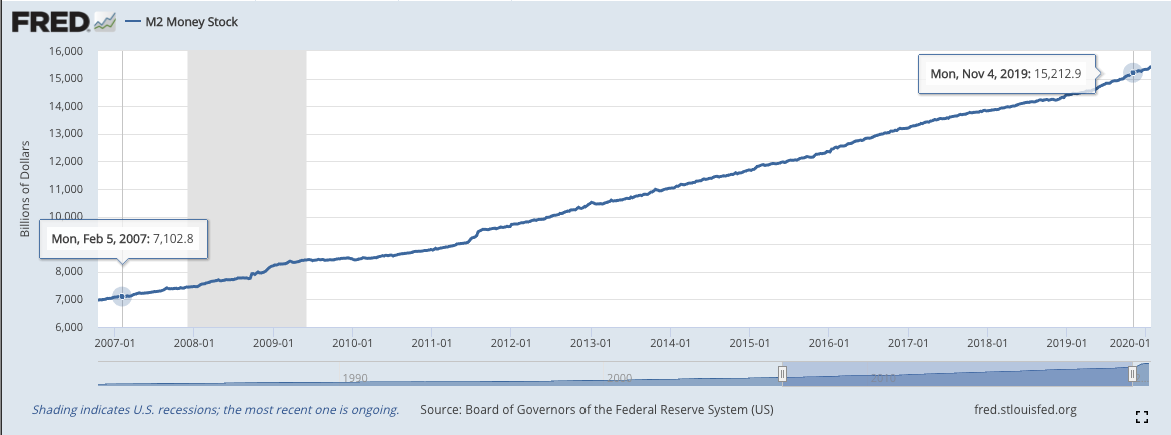
M2 is a measure of the U.S. money supply that includes cash, checking deposits, savings deposits, money market securities, mutual funds and things like certificates of deposit, some of which under $100k. It is a closely watched inflation indicator. As with most things in our complex economy, it can be increased due to numerous factors.
This has a lot to do with money printing — a trend that helped get us out of the last recession, lower unemployment to its lowest in history, and helped fuel this historical bull market.
This trend was also greatly accelerated by the virus.
Post-COVID Monetary Supply
During the initial COVID shock and lockdowns, the stock market saw its fastest fall in history and the most devastating crash since the Wall Street Crash of 1929 — the so-called Coronavirus Crash.
This shock put the central banks and governments in a dicey position — they were forced to provide monetary stimulus in order to both stabilize the markets and provide relief to the unemployed, low-income families, and small businesses.
And so they did — the US passed a $2.2 trillion stimulus package, most notably going toward:
– $600 extra per week going to the unemployed
– $1200 checks sent to every American earning less than $99k/yr
– a controversial $500B in loans to large corporations
– $377B in zero-interest loans for small businesses that can be forgiven
The progress of the stimulus can be tracked at https://www.covidmoneytracker.org.
The rest of the world also printed massive amounts — e.g Europe approved a €750B purchase program.
It’s worth taking a moment to pause and digest how large these numbers are.
A trillion is one million million — 1,000,000,000,000, or one thousand billions ($1000B).
This is large both in absolute and in relative terms — our monetary supply was close to $15.5T before COVID. This is most evident in the sudden rise of the US monetary supply:
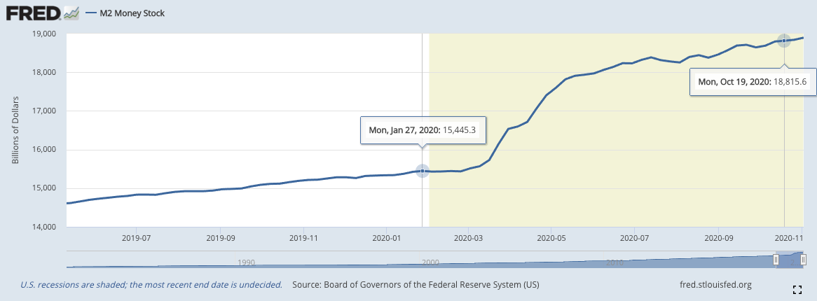
In essence, we saw the M2 Money Stock increase by more than $3000B (20%) in 6 months (March-Sept) as much as it did in the previous 4 years from 2016 to 2020.
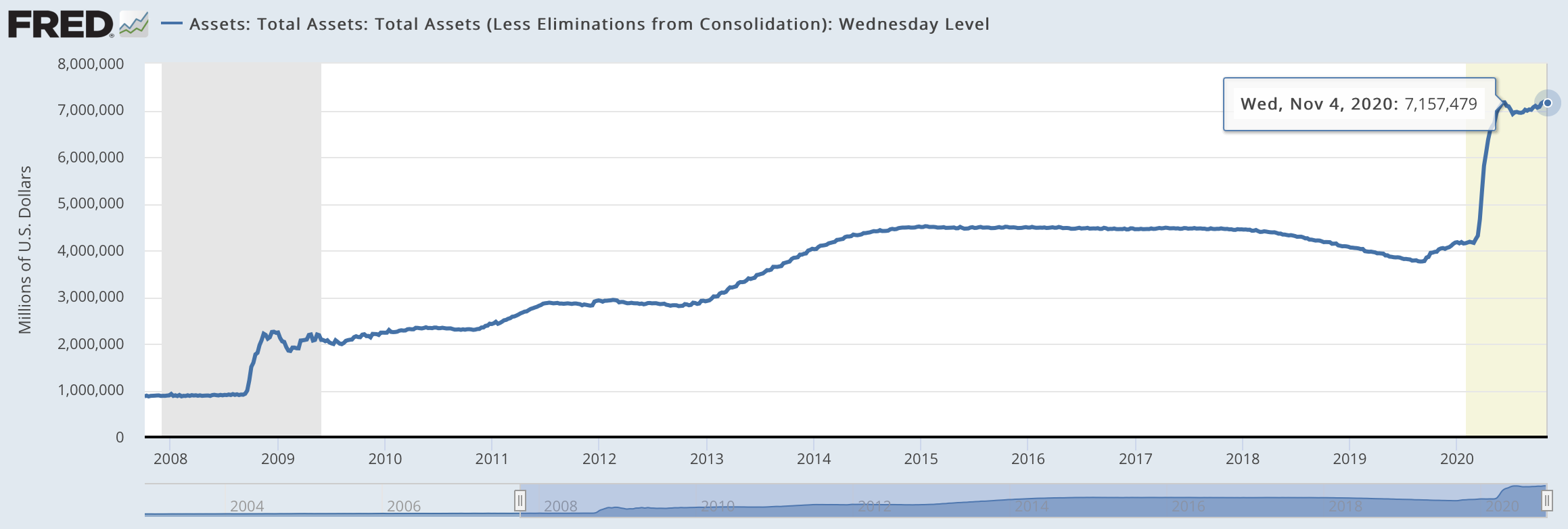
This was because in six months the Fed printed more money than it did during the decade after the 2008 financial crisis.
– In Jan 1 2009 it had $2.12Tn on its balance sheet.
– It started 2020 with $4.17Tn.
– By June 2020, its balance sheet was at $7.16Tn.
So, the problem with cash stems from who controls its supply and inflation, i.e., the Federal Reserve.
Tomorrow, we’ll go into why they’ve blown up the dollar and what that means for other investment classes.

The ReadySetCrypto "Three Token Pillars" Community Portfolio (V3)
Add your vote to the V3 Portfolio (Phase 3) by clicking here.
View V3 Portfolio (Phase 2) by clicking here.
View V3 Portfolio (Phase 1) by clicking here.
Read the V3 Portfolio guide by clicking here.
What is the goal of this portfolio?
The “Three Token Pillars” portfolio is democratically proportioned between the Three Pillars of the Token Economy & Interchain:
CryptoCurreny – Security Tokens (STO) – Decentralized Finance (DeFi)
With this portfolio, we will identify and take advantage of the opportunities within the Three
Pillars of ReadySetCrypto. We aim to Capitalise on the collective knowledge and experience of the RSC
community & build model portfolios containing the premier companies and projects
in the industry and manage risk allocation suitable for as many people as
possible.
The Second Phase of the RSC Community Portfolio V3 was to give us a general idea of the weightings people desire in each of the three pillars and also member’s risk tolerance. The Third Phase of the RSC Community Portfolio V3 has us closing in on a finalized portfolio allocation before we consolidated onto the highest quality projects.
Our Current Allocation As Of Phase Three:

Move Your Mouse Over Charts Below For More Information

The ReadySetCrypto "Top Ten Crypto" Community Portfolio (V4)
Add your vote to the V4 Portfolio by clicking here.
Read about building Crypto Portfolio Diversity by clicking here.
What is the goal of this portfolio?
Current Top 10 Rankings:

Move Your Mouse Over Charts Below For More Information

Our Discord
Join Our Crypto Trader & Investor Chatrooms by clicking here!
Please DM us with your email address if you are a full OMNIA member and want to be given full Discord privileges.