After an initial selloff from rising rates, equity markets will recover once central banks provide the market with trustworthy expectations. The catch here is this rise unfolds amidst a backdrop of heightened volatility. Meaning we don’t need to get overly doom and gloom as rates go higher. Instead, we really need the FED to simply remain consistent for several months.
As a quick refresher, the framework for the Fed’s actions can broken down into four parts:
Zero rates
Rising rates
Plateauing rates
Falling rates
We are currently in a rising rate environment, and on the lookout for when rates transition from rising to plateauing or pausing. In this environment, we tend to realize a melt up or last run up in the market is likely to unfold before things get really ugly.
I know what you are thinking, we’re already witnessing the land beneath our feet go up in flames. It can’t possibly get uglier.
But let me remind you of something real quick. Ever since the market topped in November 2021, Powell and the Federal Reserve have continually and successfully delivered a bit more hawkishness than what the market expected.
As an example, here is a quote from Federal Reserve Chairman Jerome Powell in May during a Q&A session, “A 75-basis-point increase is not something the Committee is actively considering.”
They hiked rates by 75bps the next month.
The result of how the FED talks versus how it walks means the market cannot trust what the FED says.
Which is to say if the market believes the FED will do X, it will likely do X+1. Continually changing goal posts like this has prevented any market rally from having any success.
Historically, markets do OK during a rate hike regime. It is not the part of the cycle where markets suddenly collapse. Market collapses tend to occur after rates stop rising, and after the first leak begins within the opaque financial plumbing.
The problem to date is the lack of a mutual understanding between the market and the FED. Sure, the FED has told investors rates will rise and liquidity will dry up a bit… But they have not been able to keep their word in terms of sticking to any sort of plan as we continue to raise rates.
This has yet to happen. And part of the reason is due to a trifecta punch of inflation.
This is Not Normal
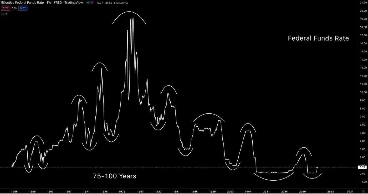
A typical cycle starts with the Federal Funds Rate starting low, progressing higher, stalling out… then forming a trough once again.
Here’s what that pattern looks like over the last 70 years.
And in the last 40 years, when the rates form a cyclical low, a lower low is realized.
This trend has now progressed to where the low has hit zero multiple times now with the ‘highs’ still failing to for a fresh high. Based on this, rates are compressing towards zero.
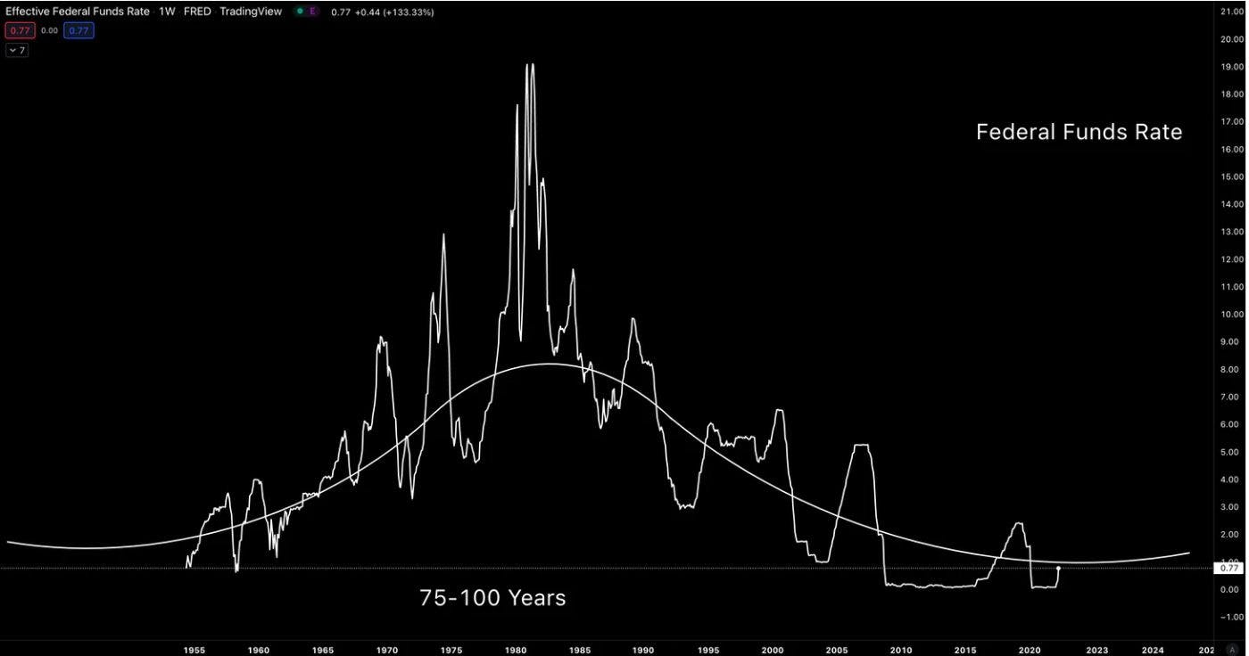
This is suggesting the current time period is carving out the bottom of a larger time framed cycle.
Here’s what I mean by a larger time framed cycle.
Now, when it comes to rates, the topical subject we tend to also hear about is inflation.
With rates being so low, including the yield on low-risk U.S. Treasuries, the impact inflation has on the market is severe.
With inflation above 8% and yields flattening out around 3%, there is a significant gap of almost 6% slowly eroding away the nest egg of any saver. Meaning anybody holding $10,000 in a Treasury is losing hundreds in value due to the real interest rate… And even more if that money is sitting in a lower yielding savings account.
But getting back to our topic here within the Macro Cycles series, is this inflation a predictable and cyclical occurrence, one that can help us determine when it will end? And better yet, help with us figuring out when the FED can become trustworthy once again.
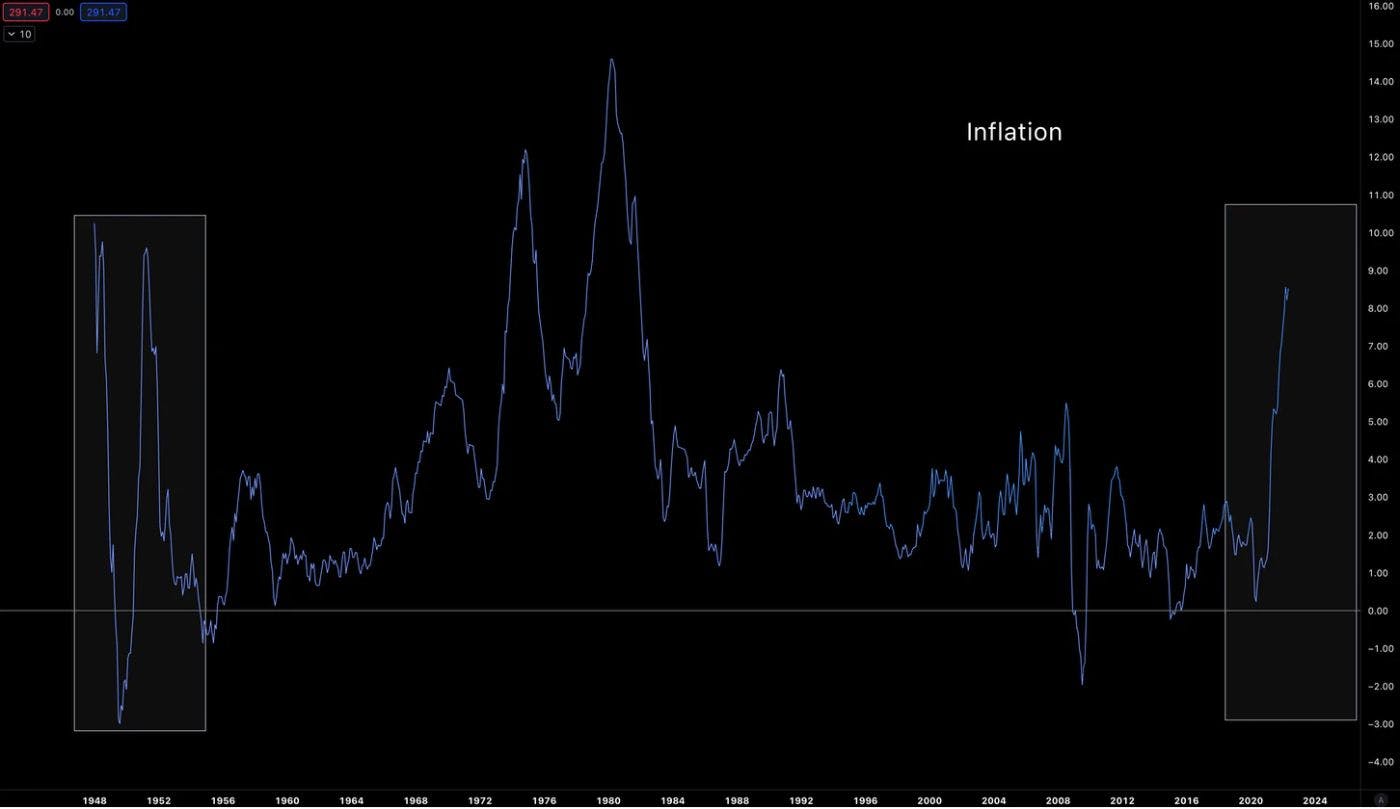
To start, let’s pull up inflation data going back to 1948.
What we can first see is that inflation seems to have a cyclical pattern. The main difference here is inflation spiked in the two periods when rates were near zero. Which means the real interest rate – short-term deposits minus inflation – was and is very negative.
Unfortunately, this really doesn’t give us much to go off of because it’s only one cycle. Eurodollars and Treasury yields offered much more opportunity for cyclical analysis thanks to it having many instruments to track.
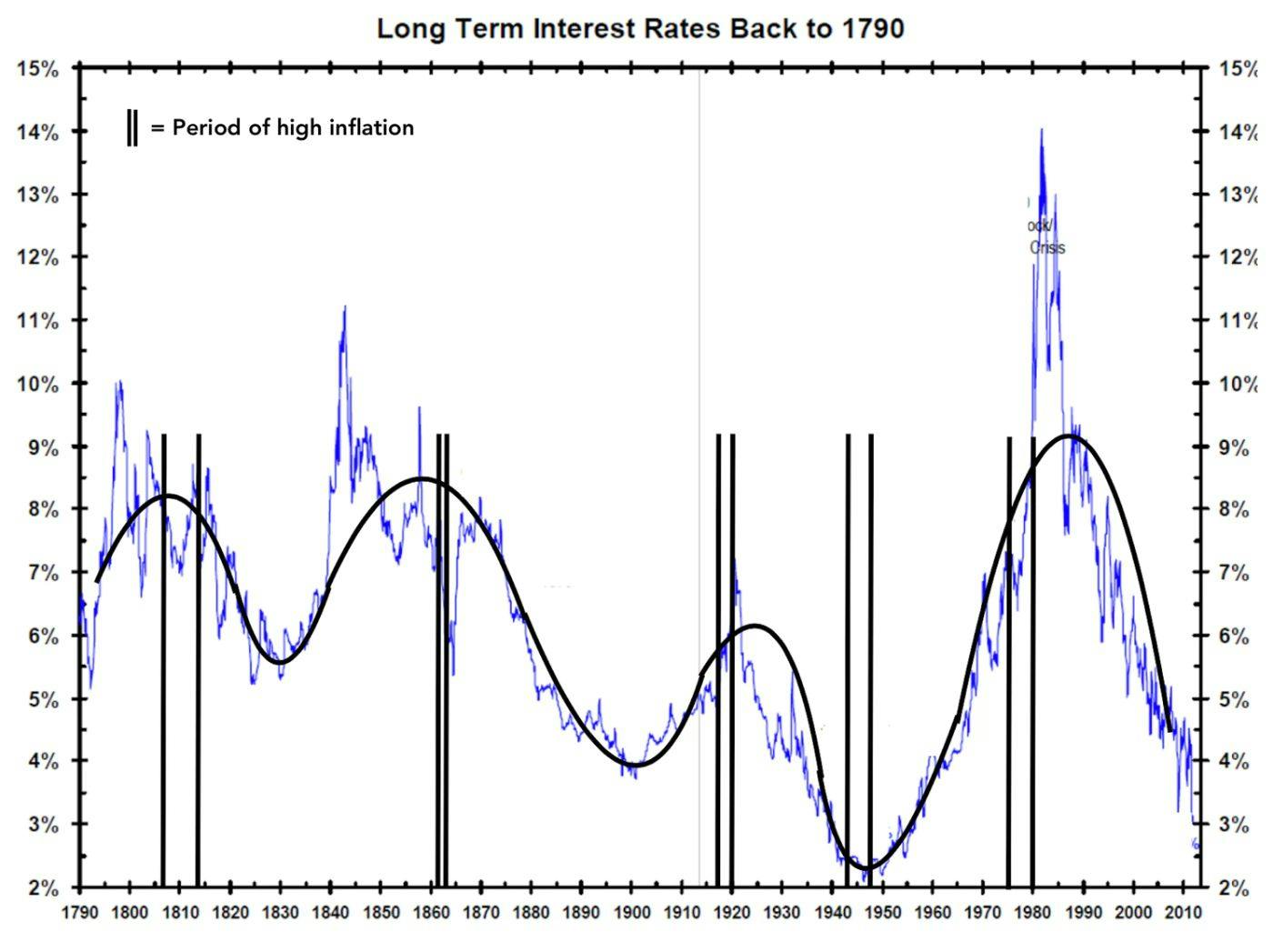
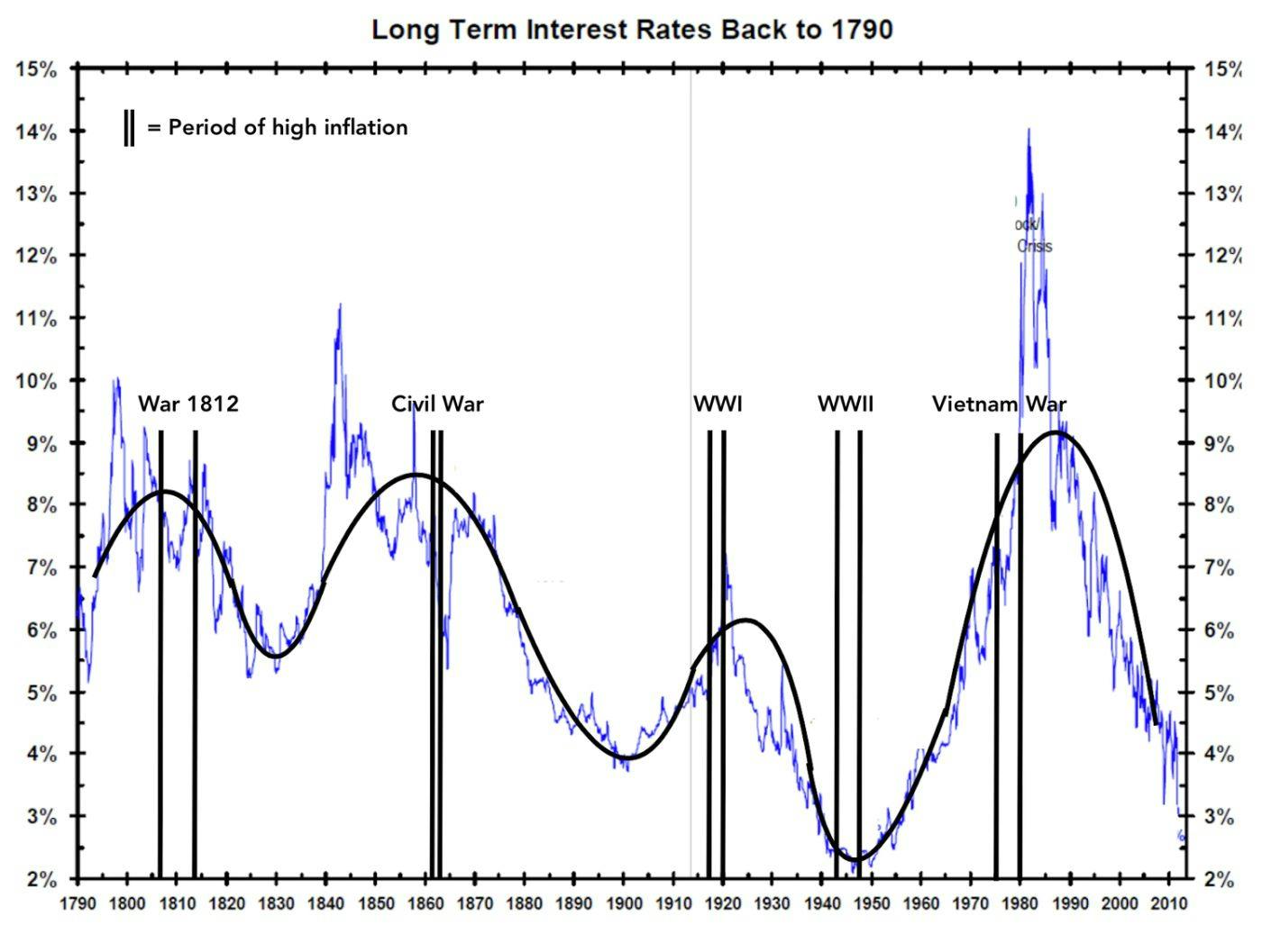
So after some more digging, my team managed to find a chart of rates and a table of inflation rates that went back to the late-1700s (h/t: Bianco Research).
To determine if the pattern we just looked at over the last 75 years is something to note, we added a smoothed line (thanks paint) to the 225-years of rates data. Then dropped in a few vertical lines to denote periods of double-digit inflation.
Here’s what it looked like… Take note where in the cycles inflation became excessive.
Inflation coincided with cyclical highs. This is in contrast to what we saw in our prior chart, which had high inflation when rates were at their lowest points and highest points.
This threw me for a loop at first glance. But after spending a few minutes looking at each time period in a historical context these high inflation periods made more sense. To save you the time of googling through history I went ahead and added in some labels.
The events labeled below played significant roles in contributing to higher levels of inflation in each time period.
The U.S. experienced higher levels of inflation when it was financing war.
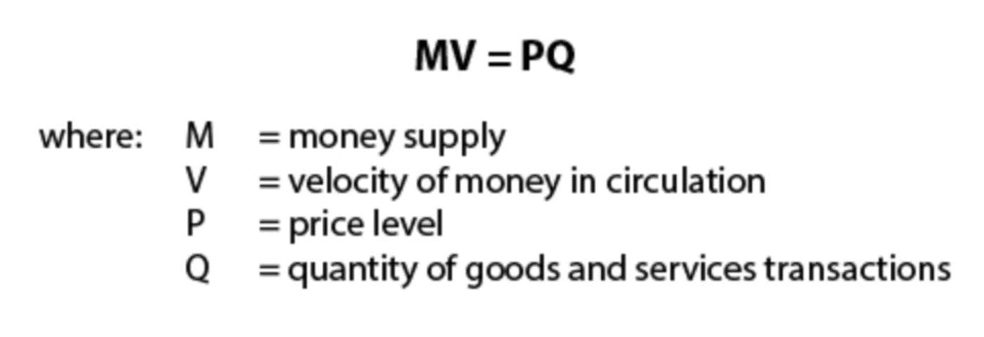
This is relatively straight forward. And to help explain it, I’d like to introduce to you our mental framework for this issue…
It is an equation that many of you may have seen hundreds of time in your career. While others may have only glanced at it a few times before without really giving it much thought.
It’s the Quantity Theory of Money. I’m pretty sure Economists think this equation pre-dates dirt. And for everybody else, I hope I didn’t just put you to sleep.
In case you did almost snooze off, I ask that you bear with me a moment while we quickly run through what this equation is all about:
It makes things a bit easier when you know “Q” is really measuring the amount of phones, cars, and NFTs a country created.
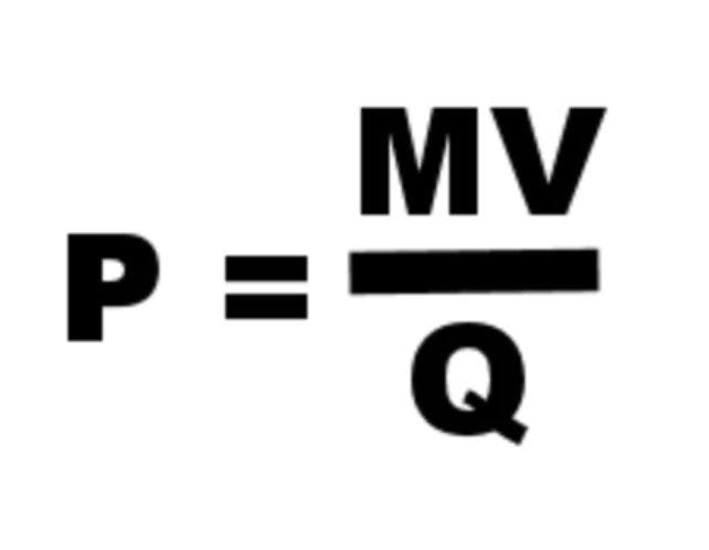
Anyways, the reason I grabbed a box of chalk and put on my tweed this morning is to talk about the influences of “P” here, which is another way of saying inflation. If we re-arrange the equation so that we keep inflation all by its lonesome it looks like this:
Focus on those three letters on the right-hand side. These refer to the total amount of dollars floating around “M” and the number of times those dollars moved around “V”. These two sit on the top, which means as these variables get larger, the “P” value goes up… If they fall in value then “P” goes down.
In contrast, the amount of goods created refers to “Q”… and if this value rises, then “P” gets smaller. If it “Q” shrinks, then “P” gets bigger.
To say all this another way, if there are $100 in the economy (M), each dollar was spent 4 times (V), and the amount of things produced equal 400 (Q), then the price level is 1.
But if you double the amount of dollars from $100 to $200 while nothing else changes, you get 2. Meaning inflation just doubled. This is “brrrr” in an academic sense.
Now in reality, “V” and “Q” don’t sit still… just like your sister’s three year old toddler.
In fact, if we go back to the prior chart showcasing periods of high inflation, these spikes took place when the U.S. financed war. Which is to say the amount of dollars floating around the system rose – aka “M” got larger thanks to the government’s printing press.
“M” rising in periods of war is understandable…
But to add fuel to the fire, the denominator aka “Q” or tinker toys sold in an economy also played a role in all these time periods.
To quickly explain why this is the case, assume the amount of dollars and movement of those dollars remain unchanged. If this is the case, when manufacturers make less NFTs and cars, then the equation spits out higher inflation or a bigger “P” value.
Having more money plus less stuff produced is a one-two combination that adds jet fuel to the fire of inflation. If you look at the the chart below, we see that the economy experienced a recession each time there was inflation. Meaning each time period likely experience this one-two combination of more dollars and less output.
Alright, so with that boring background discussion of the Quantity Theory of Money using historic data, it’s time to see what is happening today… And figure out if we can predict when inflation will slow down.
The Trifecta
The historic one-two combination is at work today.
If we take the pandemic in 2020 and view it as a war, then we can say there are similarities. The amount of dollars went parabolic and gave rise to the Jerome Powell “Brrr” meme we are likely tired of seeing.
But if you recall in 2020, inflation didn’t show up right away. In fact, it was so slow to rear its head that some believed inflation would never show.
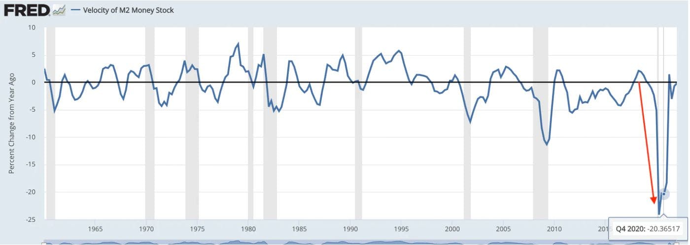
The main reason it took so long to appear is that the movement of those dollars or “V” stalled out. The war on COVID resulted in a lockdown where nobody was spending money.
And the chart below highlights the magnitude of this drop in “V”. It was massive.
It translated to a massive drop in the demand for goods and services. People were not going out and buying things. But this all changed as lockdowns started to wind down and people were bored. Citizens around the world were eager to get back out into the world, which eventually led to a surge in demand.
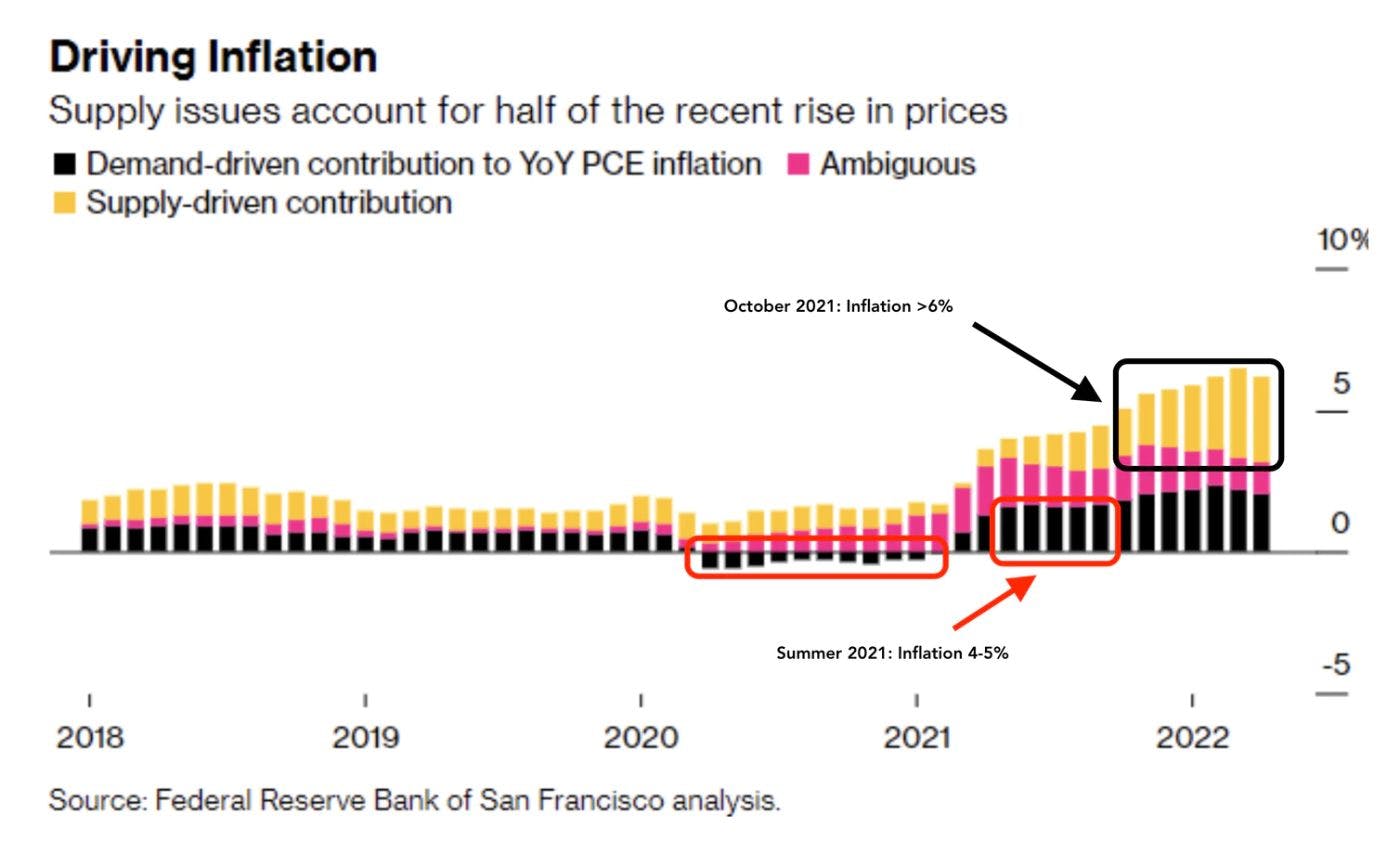
In the chart below the shift from no demand to excess demand is seen in the red rectangles. This caused inflation finally to show up to the point where people began to worry. This was the moment that “V” turned on the music at the inflation party.
The party didn’t stop there. Instead things escalated. Note the timing of the black box in the chart above. It’s right about the time markets topped and the FED began its perpetual lying phase.
Reason being is the excess in demand resulted in stuff not getting to their final destination. Meaning less cars, guns, and corn were getting sold. Going back to our framework, this is that lonely denominator of “Q” falling, causing “P” to rise even more.
Now, a quick note on “Q” here. Some folks like to use GDP in its place. But let’s quickly discuss why that’s not the best measure.
If the entire economy were cars, we would measure the number of cars sold… Not necessarily the dollar value of all the cars. That’s because the price of the car is how we measure inflation. So sticking this dollar amount into our “Q” variable doesn’t make much sense now does it? It’s a bit of a feedback loop.
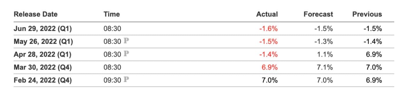
So while the GDP dropping for the U.S. over the last four months is alluding to output dropping and supply chain issues, it doesn’t do a great job. (Declining GDP showcased below)
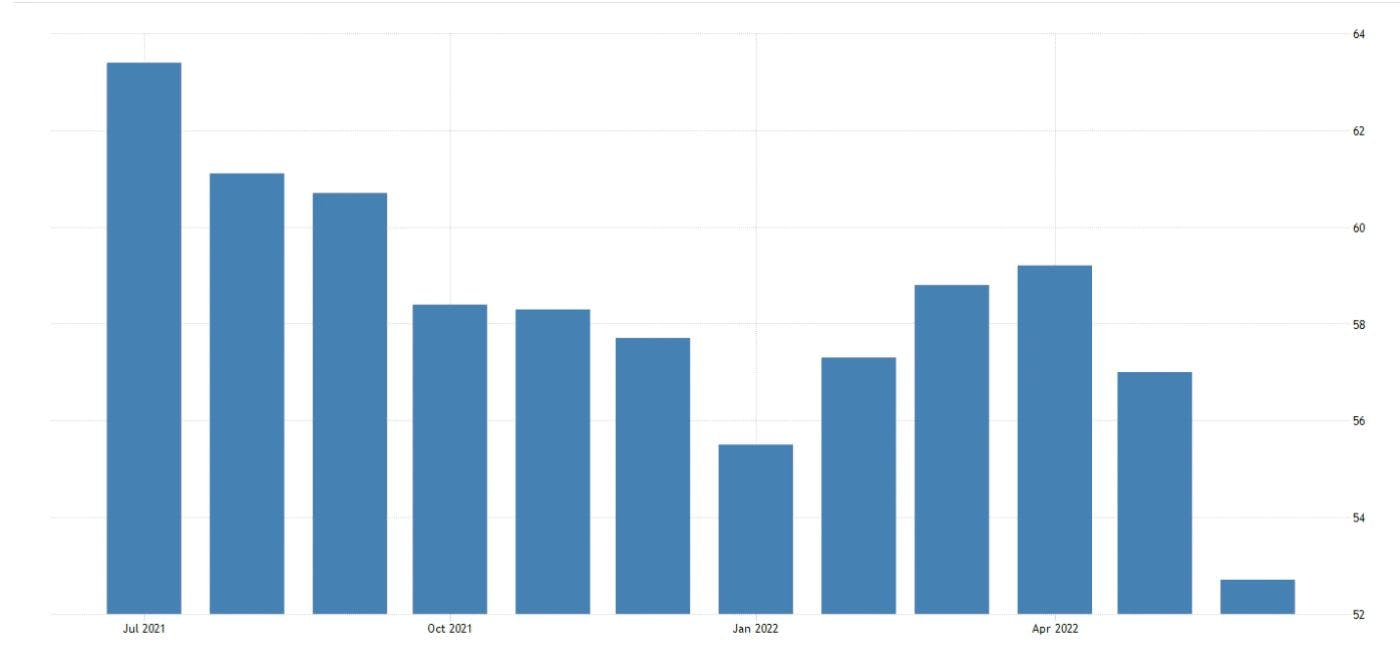
To paint this picture a bit better, let’s pull up manufacturing orders via PMI. As you can see in the chart below, this is quickly dropping.
In fact, PMI has been dropping ever since late-summer of 2021 as pent up demand was being realized in the economy for several months.
So what we have here is “Q” causing inflation to rise, “V” rising from pent up demand, and “M” going parabolic thanks to the FED. This wasn’t and isn’t a one-two combination… It’s a trifecta. All three variables are headed in the wrong direction. This is likely why the FED and J Powell find themselves in such a tricky spot.
Their act of raising rates is slowing the quantity of goods being produced. It’s also disincentivizing companies who wish to invest in improved supply chain setups to help meet rising demand. This is due to borrowing costs rising from the higher rates.
So where will the relief on inflation and our equation come from…
It Comes Down to Productivity
It should be relatively straight forward in terms of what we need to watch out for. We need the amount of money in circulation to come down… Which if history is any suggestion here, it is nearly impossible.
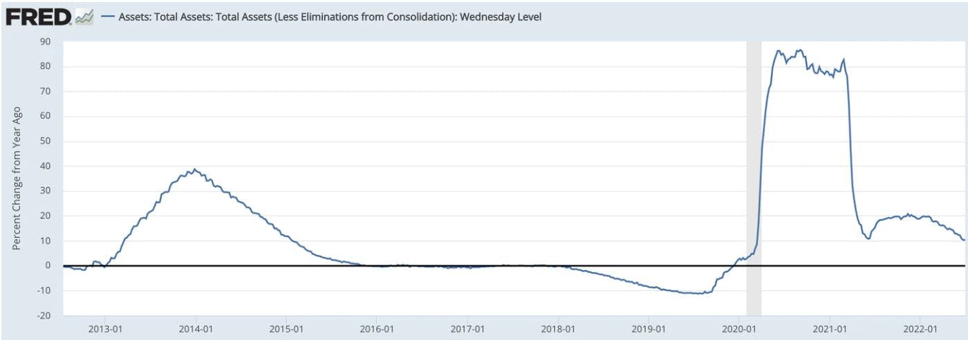
The chart below shows percentage change in the FED’s balance sheet from one year ago. When this goes negative, the FED is essentially reducing some supply. In 2019, in a rare moment, this figure when negative… And the overnight lending markets went haywire. This caused the FED to expand its balance sheet again even before the pandemic was underway.
And as you can see, we have yet to go negative despite the FED trying to reduce its balance sheet.
This leaves us with “V” and “Q”.
Let’s start with “V” first. The movement of dollars is likely to slow thanks to a combination of factors. This includes general declines in equity market prices, real estate prices cooling off, and companies beginning to layoff significant chunks of their workforce over the last 30-60 days.
It is another way of saying times are getting tougher. Less household spending is likely to take place on average. And what we see is this reduction is already underway, meaning one of the factors impacting inflation is actually showing a good sign for inflation. In an ugly and somewhat twisted way, these economic difficulties are good for inflation.
But that assumes the last piece of the puzzle is unchanged.
When it comes to “Q”, let me remind you of something we hit on earlier – The IMF just stated a global recession is likely in 2023. Then to back that up, PMI’s are not just trending down in the U.S., but country by country.
This is that dreaded stagflation. Dropping productivity that causes “P” to climb. And it is likely to cause governments to try and act in the face of this catch-22 between the top part of the equation and “Q”.
How do you boost “Q” while having the other two remain unchanged or fall?
I’ll suggest two possibilities. The first is pretty much written in the stars, the second is where I’m putting my money because it’s truly the main path out of this cyclical mess of rising/cutting rates, QE/QT, and inflation.
Solutions
First up, reducing “V”…
50-year Treasuries. Expect them. These bonds act as sink holes that bring “V” down. For all you crypto-native readers, this is like a project introducing a staking component. It’s an inflationary sink hole as dollars flow into an instrument where it doesn’t move for a longer period of time.
What this also does is enable longer borrowing terms on homes (ie. 40-year mortgage) that reduce monthly expenses for households… Making inflation more “affordable” for the everyday individual.
Same goes for eight or nine year auto loans. Yes, the asset depreciates overtime. But electric vehicles do have a longer shelf life. And longer loan terms again make inflation more affordable. Now cars can keep being sold, houses are sold, remodels can happen, and new couches can be purchased.
It’s a way to bring “V” down while maintaining “Q”. But this is not a long-term fix. Just another patch of duct-tape. Just like the subtle forms of MMT that will become more and more prominent in the coming months.
It is all done to keep pitch forks at bay from those experiencing the brunt of this ugliness while also trying to maintain the same level of goods being sold.
Again, this is just duct-tape that is applied to the problem until excess demand and supply chain issues resolve themselves. The idea here is to buy enough time so that inflation inches its way back down. But this is no permanent solution to “Q”.
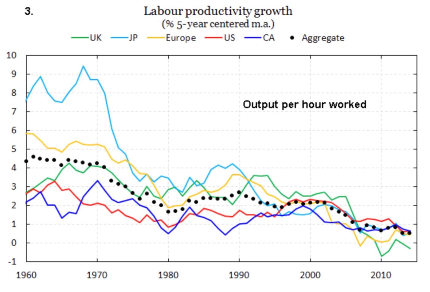
The permanent solution that is becoming a necessity is highlighted in the chart below. It brings us to our second solution… labor productivity growth.
The last sixty years, productivity growth has trended down… and is negative in some areas of the world. Similar to the trend of central bank rates.
To combat this issue of declining productivity, governments are likely to tackle it via large and expensive top-down infrastructure plans. For U.S. history examples, this was the New Deal situation almost approaching one-hundred years ago that created many administrative organizations in rapid succession. Large projects like Dams were in high order, many of which have been torn down due to negative environmental impacts. (Yes, some projects have had good impacts, but generally speaking much of these projects were wasted dollars.)
Combating this downtrend in productivity is where current technological advancements play a role. This includes robotics, artificial intelligence, autonomous cars, and more.
These all have promise. But a key to unlock the productivity is by enabling people in general to create these innovations. For anybody that has operated in the blockchain industry understands this more so than most around the globe.
This all might seem overly optimistic and hopeful, but the path to higher productivity is in token economies.
To explain what I mean here, it’s easier to look at it through a blockchain and cryptocurrency lens. If a founder runs a business that touches several networks like Ethereum, Solana, and Arweave. Then they have a reason to hold those network’s native currencies.
This is similar to the world that Zoltan Pozsar, Global Head of Short-Term Interest Rate Strategy at Credit Suisse, paints. He calls it Bretton Woods III. It’s a world driven primarily by commodities. It’s no longer a world where the US dollar is the reserve asset. Instead businesses and nation-states need to focus on their portfolios and nation’s security through the lens of commodities.
If we take that same lens, and look at how businesses are taking root on decentralized and permissionless networks, we can see this same commodity centric mindset playing out. Wallets will need to be composed of a mix of tokens for businesses to operate.
This path forward helps cut out middle men, reduces exorbitant rents that exist in the economy, and can tear down monopolies – yes, overly optimistic. But what other alternative is there? This is something I do plan to expand on upon in essays to come. So feel free to take it all with a healthy dose of skepticism.
But for now, I ask for you to keep an open mind.
The ReadySetCrypto "Three Token Pillars" Community Portfolio (V3)
With this portfolio, we will identify and take advantage of the opportunities within the Three
Pillars of ReadySetCrypto. We aim to Capitalise on the collective knowledge and experience of the RSC
community & build model portfolios containing the premier companies and projects
in the industry and manage risk allocation suitable for as many people as
possible.
The Second Phase of the RSC Community Portfolio V3 was to give us a general idea of the weightings people desire in each of the three pillars and also member’s risk tolerance. The Third Phase of the RSC Community Portfolio V3 has us closing in on a finalized portfolio allocation before we consolidated onto the highest quality projects.
Our Current Allocation As Of Phase Three:
Move Your Mouse Over Charts Below For More Information
The ReadySetCrypto "Top Ten Crypto" Community Portfolio (V4)
Read about building Crypto Portfolio Diversity by clicking here.
What is the goal of this portfolio?
The “Top Ten Crypto” portfolio is a democratically proportioned portfolio balanced based on votes from members of the RSC community as to what they believe are the top 10 projects by potential.
This portfolio should be much more useful given the ever-changing market dynamics. In short, you rank the projects you believe deserve a spot in the top 10. It should represent a portfolio and rank that you believe will stand the test of time. Once we have a good cross-section, we can study and make an assessment as to where we see value and perhaps where some diamonds in the rough opportunities exist. In a perfect world, we will end up with a Pareto-style distribution that describes the largest value capture in the market.
To give an update on the position, each one listed in low to high relative risk:
SoV/money == BTC, DCR
Platforms == ETH, XTZ
Private Money == XMR / ZEC / ZEN
DeFi == MKR / SNX and stablecoins
It is the most realistic way for us to distill the entirety of what we have learned (and that includes the RSC community opinion). We have an array of articles that have gradually picked off one by one different projects, some of which end up being many thousands of words to come to this conclusion. It is not capitulation because we all remain in the market. It is simply a consolidation of quality. We seek the cream of the crop as the milk turns sour on aggregate.
Current Top 10 Rankings:
Move Your Mouse Over Charts Below For More Information